Driving financial engagement through personalized, intelligence-led messaging

I led the UX strategy & product to bridge the gap between AI decisioning and human-centered interface patterns. By treating the UI as a part of the machine-learning loop, we shifted from "shouting" at users to providing context-aware recommendations.
+10–30% improvement in click conversion, depending on the kind of communication (validated through controlled experiments).
+22% improvement in sales rate for products in the specific domain.
1
Deep Benchmarking & Desk Research
Analyzed 41 apps: banks, digital wallets, fintech, investment brokers
Studied 8 main competitors to identify patterns in features, interface, and layout.


2
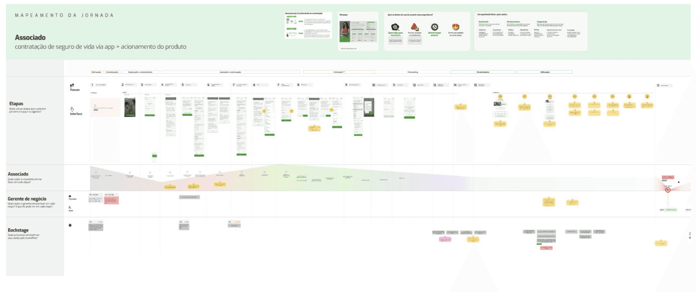
Journey Mapping
Mapped 15 financial products journeys, aligning different teams in a cross-transversal role to understand the overall experience from communication

3
Context-Based Categories
I systematized communications into 8 life user goals categories based on user journey and pain points. This helped systematization for the AI algorithm.
4
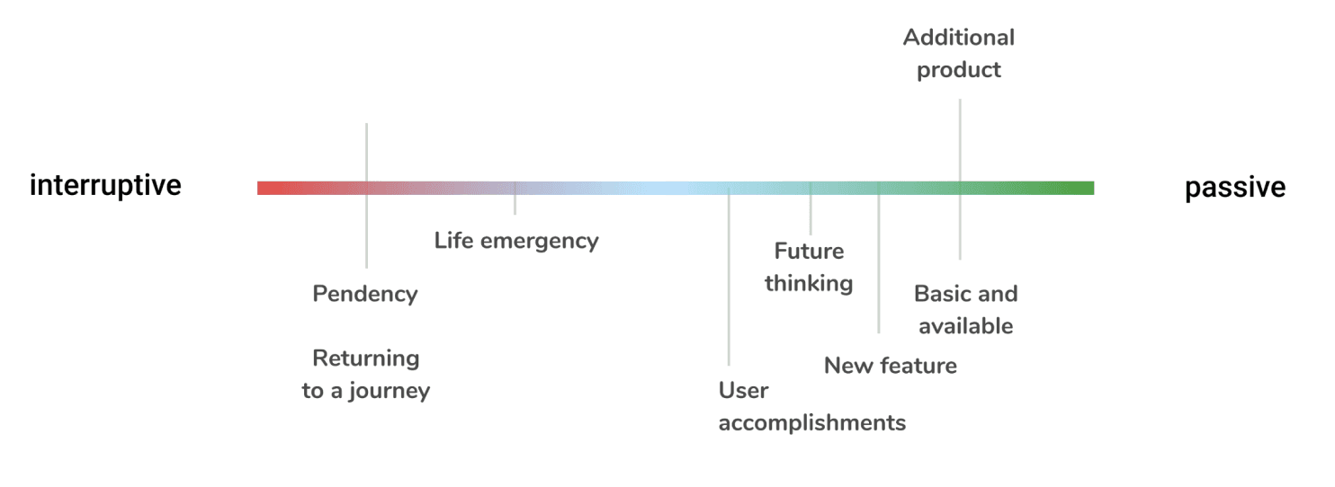
Interruptive vs Passive
Not all messages deserve the same priority. I created a spectrum to create a shysthem related to IA

Communication Design System
5
Interface Patterns
By mapping interface patterns to specific user goal categories, I created a framework that connects AI logic to the user experience. These guidelines now empower internal teams to design consistent, context-aware AI communication across the product

6
Intelligent Components
Final components designed to appear contextually across the app — personalized and automated by AI based on each user's behavior and journey.
User closes message → Selects reason → AI learns → Better targeting


7
Guidelines: When to use each pattern
I created guidelines connecting user context to design patterns— so the AI knows when to interrupt and when to stay quiet.
Business Impact
Conversion Lift
10-30% higher conversion vs. traditional channels
Reduced noise
40% fewer dismissed messages after AI learning period
Team velocity
15 product teams now ship personalized communications
❤️
You made it to the end!
Glad you stayed. Here's what else I've built

Strategic Redesign for B2B Procurement
Expanded scope from style guide to product strategy. 57% faster workflows, 70% user satisfaction.

Financial Account App: From Zero to Market Launch
Building from zero, I used design to turn banking ambiguity into a shared vision—aligning teams through a minimalist experience that secured 27% growth.

